
6 Analytics Tools for Every SaaS Businesses
Analytics tools for SaaS businesses are extremely crucial because it is impossible to improve your KPIs if you can’t measure them. SaaS operates with a funnel – right from audience interaction to subscription purchase and beyond. Given that the funnel spans across functions, there is a need for different analytics tools for SaaS businesses in different parts of the funnel. Manually analysing the funnel data is likely to result in mistakes, erroneous ROIs, and a complete waste of effort. Running a SaaS requires monitoring the metrics on a daily basis, and there are ample tools to monitor those metrics. These tools provide you with analysis and insights in just a few seconds.
While, on the bright side, there are several analytics tools for SaaS businesses available online, the sheer number of tools on the market can be overwhelming. It’s critical to choose the platforms that are most suited to your team’s needs and objectives. We’ll introduce some of the most helpful analytics tools for SaaS businesses in this blog along with the metrics you’ll probably measure with them.
Importance of Analytical Tools for SaaS Companies
Funnel analytics can help SaaS companies to track, monitor and improve upon KPIs, and hence, grow sustainably while improving funnel performance & customer retention.
1. Marketing Analytics:
SaaS GTM teams benefit a lot from using marketing analytics to better understand their marketing efforts, visitor behaviour, and the efficiency of different marketing channels. They can employ this data to make data-driven decisions, improve their marketing plans, and effectively manage resources. Teams can utilise marketing analytics to find high-performing marketing channels, comprehend their demand generation costs, track the success of campaigns, and fine-tune targeting to increase conversions & boost return on investment (ROI).
2. Product analytics:
Product analytics provides product teams with detailed information on how product users utilise their SaaS products. It aids in the identification of user behaviour trends, new feature utilisation rates, & user pain areas. Product teams can prioritise feature upgrades, streamline their product development procedures, and improve user experience by analysing this data. In order to better match their product vision with user demands and ultimately boost customer satisfaction & retention, companies can leverage product analytics to analyse user trends, user cohorts, and user engagement metrics.
3. Sales Analytics:
Using sales analytics, SaaS sales teams can track and examine their sales activity, customer engagement, and revenue generated. Teams can identify possibilities for improvement & optimization of their sales strategy by monitoring sales data including conversion rates, new customer acquisition expenses, and average transaction size. Businesses can estimate the sales funnel, find cross-selling and upselling possibilities, and spot patterns and trends in customer behaviour by using sales analytics.
Key Metrics to Track for SaaS Businesses
SaaS founders must monitor the appropriate indicators and optimise them if they want to expand their SaaS business. They must track a variety of data to comprehend their effect on your company’s performance, from your website’s layout to your marketing initiatives. Additionally, it will assist them in comprehending the levers that influence conversions and aid in customer retention. Here are a couple of critical KPIs for the development of your SaaS business:
1. Monthly Recurring Revenue (MRR):
MRR is a crucial indicator for SaaS companies since it shows the expected monthly revenue from subscriptions. You can assess your revenue growth, spot patterns, & gauge the success of your pricing & subscription strategies by monitoring MRR. Your company can assess the quality of your ongoing revenue streams by tracking MRR, which enables them to make wise choices regarding retention of customers, expansion, & scalability.
2. Customer Churn Rate:
Over a certain time period, the percentage of customers that cancel their subscriptions is measured by the customer churn rate. Substantial churn rates have a negative effect on sales & hinder growth. Your team can spot potential problems, comprehend the causes of cancellations, and implement proactive steps to increase customer retention by tracking customer churn. This measure can assist you in streamlining your onboarding procedures, improving customer satisfaction, & prioritising initiatives to lower turnover.
3. Customer Lifetime Value (CLTV):
The overall income earned by a typical customer over the course of their subscription is referred to as CLTV. Your company must comprehend CLTV in order to evaluate the financial impact of your customer acquisition and retention. You can categorise customers depending on value by measuring CLTV, calculating the ROI for your customer acquisition strategy, and allocating resources appropriately. Upselling, cross-selling, & improving customer satisfaction and engagement are frequently used to increase CLTV.
4. Customer Acquisition Cost (CAC):
This is a metric used to determine how much it costs to acquire a new customer. This KPI can aid your company in assessing the effectiveness & scalability of its marketing and sales initiatives. It is possible to evaluate the efficacy of your customer acquisition tactics, maximise marketing budgets, and guarantee that acquisition expenses are sustainably low by measuring CAC. For every SaaS team, lowering CAC while retaining quality customers is a critical factor in profitability & expansion.
5. User Engagement & Activation:
Monitoring user engagement & activation metrics provides insightful data on how users of your SaaS product are engaging with it. You can evaluate user satisfaction, pinpoint problem areas, and enhance the user experience by using metrics like customer logins, feature utilisation rates, and utilisation frequency. Your company can enhance customer onboarding, spot opportunities for product optimisation, and promote improved user retention rates by keeping an eye on these indicators.
6 Essential Analytics Tools SaaS businesses
Mentioned below are 2023’s top six analytics tools for SaaS Businesses. Check out these popular SaaS analytics tools to view your company’s metrics, analyse trends, and make any corrections.
Google Analytics 4 for Website Traffic Monitoring
A must-use tool for monitoring & tracking your website traffic is Google Analytics 4 (GA4). This is one of the most popular analytics tools for SaaS businesses. It offers insightful data on user behaviour & website performance. This data can be accessed from your Google Analytics account after it has been gathered and processed. There, you’ll discover a variety of metrics and reports to help you comprehend how visitors use your website. Following are the essential steps for using GA4 for tracking your website traffic & the metrics you need to monitor:
1. Set Up Google Analytics 4
Create a GA4 property in your Google Analytics account and then link it to your website to get started. This entails either employing a tag manager for simpler implementation or putting the GA4 tracking code on the pages of your website.
2. Track Key Metrics:
a. Sessions: This shows how many visits visitors had to your website
b. Users: This refers to all of your website’s distinct visitors. It aids in gaining an understanding of the size of your audience.
c. Pageviews: This statistic shows the number of times your website’s pages have been visited.
d. Average Session Duration: This reveals the average length of time visitors engage with your website throughout a session. User engagement as well as content relevancy are also easier to measure using this metric.
e. Bounce Rate: The percentage of visitors to your website who leave after seeing only one page is known as the bounce rate. A spike in bounce rates might be a sign of problems with page load speeds, the quality of the content, or the overall visitor experience.

3. Track Traffic Sources:
Google Analytics 4 keeps track of the referral web pages, social networking platforms, paid advertisements, and organic search engines that send visitors to your site. You can utilise this information to assess how well your marketing channels are working.
4. Keep an eye on your Landing Pages:
By keeping an eye on your landing pages, you can figure out which of your website’s entrance points is most frequently used. It is possible to improve user experience & conversion routes by analysing these pages.

5. Create Goals & Conversions:
GA4 enables you to create specific Goals & Conversions and lets you track them. You can track successful purchases, form submissions, or other worthwhile website actions.
6. Build Custom Reports & Segments:
GA4 gives you the freedom to design customised reports & segments in accordance with your unique business requirements. This enables you to explore data more thoroughly and acquire insights specific to your goals.

7. Make Use of GA4’s Advanced Capabilities:
Google Analytics 4 offers advanced features including better cross-device monitoring and user behaviour analysis. By using these capabilities, you can discover user journeys, improve user experience across devices, & better understand your audience.
Microsoft Clarity for Qualitative Analysis of Traffic Behaviour
A free online analytics tool called Microsoft Clarity offers both qualitative and quantitative insights into how viewers use websites. Microsoft Clarity includes certain quantitative indicators that enhance its offering, however, it largely focuses on qualitative analysis.
First, you have to create an account in Microsoft Clarity and add their tracking code to your website. The script gathers information on user interactions & transmits it to the Clarity dashboard for evaluation. Only then can you use Microsoft Clarity to quantitatively analyse traffic behaviour & monitor the metrics mentioned below.
1. Heatmaps:
Using Microsoft Clarity, you can create heat maps that show how users interact with your website. Heat maps display where viewers click, scroll, and move their pointers. You can determine which parts of your website are often visited, where user interaction is strong, and where users could feel confused or frustrated through heatmap analysis.

2. Session recordings:
You can view session recordings of users’ engagement with your website. Session recordings offer you an insider’s view of how visitors move through your website, where they run into problems, and how they interact with various features. This qualitative data assist in locating user experience bottlenecks, usability issues, and potential development areas.

3. Rage Clicks & Dead Clicks:
Clarity can identify rage clicks, which are repeated clicks made out of frustration, and dead clicks, which are clicks made on unclickable items. These metrics offer perceptions into areas that perplex or irritate customers, enabling you to enhance the user interface & the user experience as a whole.
4. Time-to-Interactive:
This indicator calculates how long it takes for customers to completely interact with your website. It assists in evaluating website effectiveness and user experience. Prolonged time-to-interaction could be a sign that there are unresolved performance concerns on your website.
5. CTRs (click-through rates):
Microsoft Clarity provides basic click-through rate evaluation, which measures the proportion of people who click on particular links or website elements. This can reveal information on the efficiency of menu navigation, call-to-action buttons, or other interactive features.
Looker Data Studio for Ads Analytics and Paid Traffic Monitoring
Another popular analytics tool for SaaS businesses is Looker Data Studio. The detailed analysis and monitoring of paid traffic especially if you use Google Search Ads can be done using Looker Data Studio. This is a potent data visualisation and reporting tool. You can develop customised reports and dashboards to monitor the effectiveness of your advertisements and paid traffic by combining data from numerous sources, such as Google Analytics, Google Ads, and various other advertising platforms. Here are some essential indicators to monitor along with instructions on how to utilise Looker Data Studio for Ads Analytics & Paid Traffic Monitoring:
1. Connect Data Sources:
Begin by establishing a connection between Looker Data Studio and your data sources, like Google Ads & Google Analytics. You can do this to gather pertinent data for reporting and analysis.

2. Design Reports & Dashboards:
Use Looker Data Studio’s drag-and-drop interface to build visually appealing dashboards and reports that meet your unique requirements. The layout can be modified, and you can add graphs, tables, and various other visual components to highlight the statistics and findings you wish to monitor. You can also choose from the pre-built templates provided in Looker Data Studio while creating your reports & dashboards.

3. Track important metrics:
a. Impressions: With this, you can calculate how frequently the audience sees your advertisements.
b. Clicks: Track the number of clicks your advertisements receive to gauge the audience’s curiosity & engagement.
c. Click-through Rate (CTR): Calculate the proportion of people who click on the advertisements after seeing them utilising this metric. Ad performance & relevancy are assessed using CTR.
d. Cost Per Click (CPC): Keep track of the average amount you spend for every single click on an ad.
e. Conversion Rate: Calculate the proportion of visitors to your website that complete the intended activity after engaging with an advertisement. The conversion rate helps in assessing how well your advertising strategies are doing at generating the desired results.
f. ROAS or Return on Ad Spend: With this metric, you can calculate the amount of revenue that is made for every dollar put into advertising. Your ad campaigns’ profitability and efficiency can be evaluated with the use of ROAS.
g. Cost per Acquisition (CPA): Keep tabs on the typical expense involved in acquiring a new customer by means of your marketing efforts. CPA aids in evaluating the effectiveness of your advertising activities in bringing in new customers.
h. Quality Score: This gauges the effectiveness of your advertisements, landing sites, and keywords. Higher-quality advertisements get more favourable ad positions & reduced costs. The Quality Score ranges from 1 to 10, taking into account the anticipated CTR, the relevancy of the ads, and the user interaction on your landing page. Your advertising & landing pages will be more likely to receive better Quality Scores if they are more pertinent to the user.
i. Conversion Rate: This metric tells you how many clicks to your ad lead to a conversion.
j. Search Impression Share: This tells us the proportion of actual ad impressions to prospective ad impressions that your advertisements obtain. Impression Share is an excellent way to assess whether increasing your bid or budget will lead to more of your audience seeing your advertising or not.
4. Use Filters & Segmentation:
Utilise Looker Data Studio’s filters and segmentation features to delve more deeply into your data. To get more thorough information on how various components of your advertisements and paid traffic are doing, you can filter by certain campaigns, ad groups, keywords, or time frames.

5. Schedule & Share Reports:
You can schedule the generation of automatic reports and share them with stakeholders using this platform. This enables consistent observation and prompt sharing of data and insights.
In-built CRM analytics capabilities for pipeline analysis
You can assess and improve your sales pipeline with the use of built-in CRM analytics tools for your SaaS businesses, which offer insightful information for pipeline analysis. Numerous CRM platforms are available in the market, such as Salesforce, HubSpot, Zoho CRM, etc. Here is a broad summary of how you can utilise in-built CRM analytics for pipeline analysis & the metrics frequently tracked using the platform’s different analytical capabilities:
1. Sales Funnel Visualisation:
In-built CRM analytics frequently offer visual depictions of the sales pipeline, giving you a clear picture of the various pipeline phases. This visualisation assists in identifying possible bottlenecks, monitoring stage-to-stage conversion rates, & assessing the pipeline’s general health & effectiveness.
2. Lead & Opportunity Tracking:
These analytics let you keep track of important lead and opportunity-related indicators as they advance through the pipeline. The number of leads generated, conversion rates of prospects, average transaction size, win/loss ratios, & lead processing times in each stage are a few examples of these KPIs. You can pinpoint problem areas, enhance lead management tactics, and predict future sales success by keeping an eye on these KPIs.
3. Sales Cycle Analysis:
CRM analytics features frequently offer information on how long the sales cycle takes for various opportunities. This involves analysing the average amount of time it takes for potential leads to advance from one stage to another and spotting those that have been hung around a particular stage in the pipeline for too long. You can detect possible bottlenecks, optimise resource allocation, and improve the sales process by analysing the sales cycle.
4. Sales Team Productivity:
Built-in CRM analytics can offer metrics, including both individual and team-based indicators, relating to sales team performance. These might include KPIs for sales activities like calls made or emails sent, AE-wise win rates, and the number of transactions concluded in a given time frame. It is possible to discover high-performing sales reps, understand where performance gaps are taking place, and make decisions based on data to maximise the efficiency of your sales team by monitoring these measures.
5. Sales Forecasting:
Tools for forecasting sales are frequently included with built-in CRM analytics capabilities, enabling companies to project future revenue depending on prospects in the pipeline. Such analytics can assist your company to make educated decisions regarding resource allocation, goal planning, and revenue forecasting by taking past information, rate of conversion, and the worth of opportunities into account at each stage.
Mixpanel for Product Analytics
Mixpanel is a popular analytics platform that specializes in product analytics, offering valuable insights into user behaviour, engagement, and product performance. Here’s how you can use Mixpanel for product analytics and the metrics commonly tracked:
1. Net New User Acquisition:
Tracking the number of new customers or users obtained over a certain time period can assist your team in understanding the efficacy of your advertising and sales efforts. Teams can analyse the performance of their engagement platforms & optimise their marketing campaigns by tracking user acquisition data like the number of sign-ups on your website, downloads of your apps, or website traffic.
2. User Engagement Metrics:
User engagement metrics reveal how customers engage with your solution & the extent to which they are involved. Metrics such as time spent in your app, number of activities, & frequency of utilisation can assist you in evaluating user interest, measuring product stickiness, and identifying ways to boost user engagement.
3. Rate of Retention:
The retention rate is an important indicator that shows how successfully a product retains users over time. It calculates the percentage of customers who use your product after their first engagement with it. You can track the success of your user onboarding processes, identify sites of attrition, and execute methods to improve user retention by measuring retention rates.
4. Rate of Conversion:
The number of users who accomplish a desired activity, such as completing a purchase, enrolling on your service, or subscribing to a newsletter, is tracked by conversion rate. This metric assists product teams in understanding the effectiveness of their conversion funnels and identifying areas for development. Teams can also boost revenue and enhance overall business success by optimising conversion rates.
5. The churn rate:
The churn rate is the proportion of users that discontinue using your product or terminate their membership within a particular time frame. Tracking churn rate is critical since it allows you to gauge customer satisfaction, identify causes leading to users dropping out, and execute churn reduction actions. By tackling the causes of churn, you can boost customer retention & raise their lifetime value.
6. Customer satisfaction:
Customer satisfaction measurement is critical to comprehending how customers view your product & their entire experience. Metrics such as Net Promoter Score (NPS) or customer satisfaction surveys can assist you in gathering direct input from users. Your team can also drive customer loyalty & advocacy by tracking customer satisfaction data and identifying areas for improvement, addressing user problems, and improving your entire product experience.

ChartMogul for Revenue and Churn Analytics
The robust analytics platform ChartMogul was created primarily for revenue & churn analytics. It gives companies information about their churn rates & subscription-based revenue KPIs. Here’s how you utilise ChartMogul for metrics like revenue & churn analytics in addition to the usual metrics:
1. Data Integration:
ChartMogul integrates with your billing systems to automatically import and process your subscription data. This allows you to have a centralized view of your revenue and customer data.
2. Revenue Metrics:
a. Monthly Recurring Revenue (MRR): ChartMogul calculates your MRR, which represents the predictable and recurring revenue generated from your subscriptions on a monthly basis. It provides insights into the growth or decline of your subscription business.
b. Average Revenue Per User (ARPU): ARPU measures the average revenue generated per customer or user. It helps analyze the effectiveness of pricing strategies and identify opportunities for upselling or cross-selling.
c. Churned MRR: ChartMogul tracks the revenue lost due to churn, providing insights into the impact of customer attrition on your business.
d. Net Revenue Retention: This metric calculates the revenue retained from existing customers after accounting for churn and expansions. It helps evaluate the overall revenue health and growth potential of your customer base.
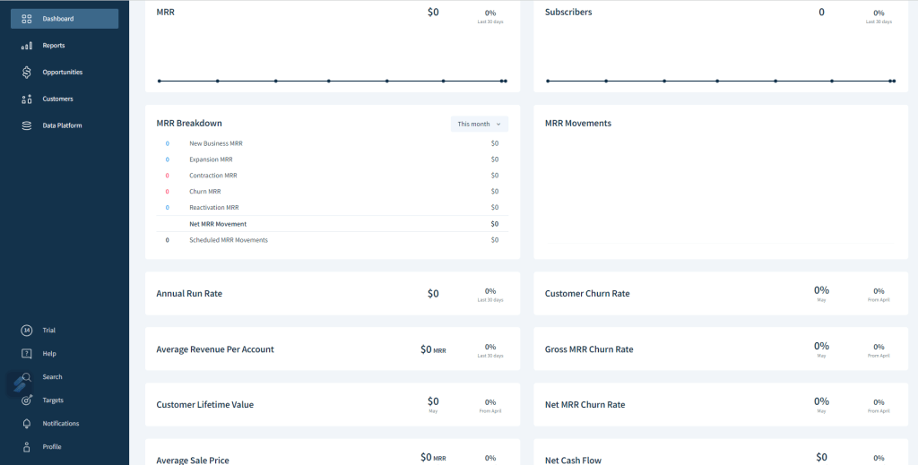
3. Churn Analytics:
a. Customer Churn Rate: ChartMogul calculates your customer churn rate, which represents the percentage of customers or subscribers who cancel their subscriptions over a specific period. It helps you understand customer retention and identify opportunities to reduce churn.
b. Revenue Churn Rate: The revenue churn rate measures the lost revenue due to churn as a percentage of your total revenue. It provides insights into the financial impact of churn on your business.
c. Cohort Analysis: ChartMogul allows you to analyze churn rates and revenue performance based on specific cohorts, such as customer acquisition cohorts or cohorts based on subscription start dates. Cohort analysis helps identify trends, understand the impact of changes or improvements, and make data-driven decisions for customer retention strategies.

4. Subscription Analytics:
ChartMogul provides various subscription-related metrics, including customer count, active subscriptions, subscription growth, upgrades, downgrades, and cancellations. These metrics allow you to monitor the health of your subscription business, identify trends, and optimize your subscription offerings.
Despite knowing about all these tools in detail, it is a difficult process to build up your entire system with analytics tools for SaaS businesses. In addition, there are also multiple tools apart from these in the market, which can be confusing. Talk to our Analytical Expert to understand how to set up this entire process seamlessly for your SaaS and which tools will be the best fit for your company!