
Looker Studio for Marketers
Data is crucial to GTM teams. Holistic data collection not only facilitates decision-making around your product but also helps you refine your GTM by effectively targeting your potential customers. This enables you to develop more effective plans to reach your GTM goals.
One of the key channels of customer acquisition is advertisements. As you go about implementing your GTM strategy, your advertising and marketing data gets overwhelmingly fast. Even preparing a clear, concise report to analyse the growth of your company will keep you occupied for days considering the huge amount of data present in only Google Ads and Google Analytics itself.
One of the best ways to cope with this challenge is utilising a data visualisation tool with data sources that refresh in real-time. This will organise all your data visually and help you to understand your efforts better. Having the capacity to visualize data offers you access to priceless insights for more effective business decisions and provides you with a significant advantage over your competitors.
While numerous tools may help you visualize data, none match Looker Studio, it is fully free and accessible to anyone. This article will help you master the most useful Looker Studio tools and produce insightful reports for your business.
What is Looker Studio?
Looker Studio is a Business Intelligence tool, which turns raw, unprocessed data into valuable information for your business. You can make a comprehensive, dynamic, and responsive dashboard with this free tool. Looker Studio collects statistics and indicators through data visualisation to help businesses take fewer risks and accomplish their objectives by supporting decision and strategy-making.
Anyone can generate and comprehend these reports since it is possible to create dashboards from templates, access the widest range of graphs, maps, and tables, integrate your brand identity, and utilize additional tools in a user-friendly manner. Your team can quickly create, read, and share reports using Looker Studio, saving time and money.

What are the benefits of using Looker Studio?
Let’s understand how Looker Studio can make your life much simpler and help you to reach your company’s goals much faster!
1. Customised Reports and Dashboards – Looker Studio enables users to build unique reports with a variety of layouts, infographics, and formatting options. There are also many pre-created report templates to pick from if you’re new to Looker Studio. If not, you may jump right in and design a new report that fits your reporting style.
2. Implement dynamic reporting – You can let Looker Studio include real-time data within the reports. You may arrange your reports to automatically update and refresh the current data in your widgets. Also, every component of this report is editable. You have countless data options available in this dynamic report to help your business.
3. Easily share access to Looker Studio reports – Looker Studio provides collaboration and report-sharing features that will assist you and your colleagues in communicating more effectively. You may easily share all of your reports via links, allowing others to access and edit them. Even better, you can make adjustments in real time when you are sharing. Your team may view that report and make adjustments at the same time.
4. Produce reports that are simple to read for everyone – Looker Studio reports may be divided into a single page or 20 pages, showcasing the adaptability and customisation of Looker Studio. It adjusts to the particular requirements of your business, simplifying the process of sharing crucial data stress-free. You can also alter the design of your report here. With this tool, you can provide your entire team with not only an overall view of all your campaigns but also an in-depth analysis from every angle of each campaign.
5. Get information from multiple sources – A strong marketing mix includes a variety of methods and tools that are used to connect with your target audiences. You may connect to several data sources (such as Google Ads, Google Analytics, Google Search Console, Sheets, etc.) into a single dashboard in Looker Studio. This tool acts as a one-stop destination for your reporting and also enables you to combine data from all these sources to produce consolidated reports.
Let’s Explore the Looker Studio Dashboard!
This dashboard should appear rather similar if you’ve ever used Google Docs, Sheets, or Drive. Let’s explore the Looker Studio Dashboard’s features in-depth and learn how you can use it to enhance your digital marketing initiatives. The most practical Looker Studio tools are covered in this section.
To begin with, all you need to access Looker Studio is a Google Account. You can directly sign in to Looker Studio using your account. You may switch between the reports you’ve just accessed and those that have already been made or shared with your user using the panel on the left. You can navigate across Reports, Data sources, and Files from Explorer using the top menu.
1. Data Source –
Data Sources are the list of connections you’ve made between Looker Studio & the original data sources. 500+ data sources are now supported by Looker Studio. The most common sources are listed below:
A. Google Analytics
B. Google Ads
C. Google Search Console
D. BigQuery
E. YouTube Analytics
F. Search Ads 360
Let’s try to determine the sources of data you intend to use –
a. From the menu on the left, select “Create” and then “Data Source”.

b. Choose the platforms you wish to connect with your Looker Studio on the next screen. You may also search for your data source in the upper left corner.

c. You must “Authorize” your source after choosing it. Only then the properties associated with that source can be connected to Looker Studio. Now the information that should be gathered from there can subsequently be determined.

After the access has been authorized, the data source will be registered. You may generate a report or use Explorer to study the data from there.
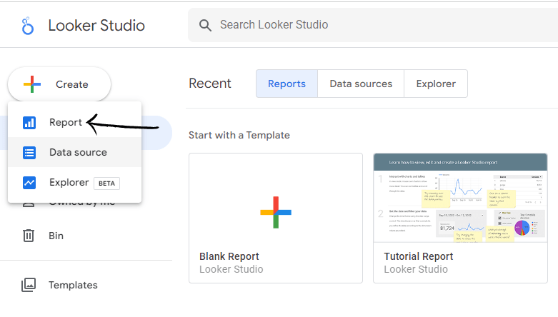
2. Reports –
Now, let’s look at how to make a report.
a. Click on “Create” and then go to “Report” in the menu on the left after selecting the Data Source. You can also use the gallery to find a suitable template.
b. Then, Looker Studio directs you to choose the data sources for your report. You can go to “My data sources” and select the source if you have previously added them as described in the step before. If not, then you can connect them in this step too.
c. After choosing the data source, you will be taken to a page where you can customise the report by adding images, text, and other elements. You can also alter the layout, and take other actions.
d. In the Right column, you can find various chart options and also combine and cross the data source parameters and dimensions to provide more intriguing information for the report.

e. The report’s top menu contains several customization options, including “Add a chart”, “Add data”, and other options. Here, you can explore all the options or possibilities under these headings (like various charts, data sources, etc.)
f. To include dynamic control choices selected by the people viewing the report, you may also choose “Add a control”. Here you can create drop-down or fixed-size lists, input boxes, apply advanced filters, control date range or data, etc.
g. The options for “Theme and Layout” can be found at the bottom of the menu. You can alter the report any way you’d like with the help of this.

h. Note that you have access to all editing and viewing settings in the top menu, as well as the ability to change the report’s name. At the right, there are options to copy the report, modify the data, view it, and share it.
i. By selecting Share, you have the option to share the report with other users, send it through email, copy the URL, embed it, or save it as a PDF.

3. Explorer –
Using Explorer, you can experiment with or edit charts without changing the report as a whole. It aims to test theories, work with data, perform analyses, and then move forward with reports. Consider, for instance, that you wish to add more dimensions or metrics to your charts to see whether they provide you with more insightful data. You do not have to alter it in the original chart if you are unsure about it. Simply modify it in Explorer and test it out. It’s simple to export the new chart into the original report if you believe it’s relevant.
a. To use Explore, visit the Looker Studio home page and select “Create” then “Explorer”.

b. After that, a blank page will appear, where you will be asked to choose a “data source” before you can begin exploring. Several chart options, along with the data, dimensions, and styles that you can select from are displayed in the menu on the right after choosing one or more data sources.
c. From the “Available Fields” panel on the top right to the filter bar, drag the dimensions and parameters you wish to use to filter the data on the charts.

d. If this chart seems useful to you then copy it to an existing report or create a fresh one from the Explorer area itself, if no report already exists.
e. Lastly, click on the ‘Share’ button to modify the access to the newly created chart, or you can just keep the permissions the same as it was for the existing chart.
Explorer can also be used from “Report” or “Data Source”. You may start making charts, experimenting with the data, etc. by clicking on the “Explore” button in the data source settings. On the other hand, in a report, you might be curious to explore more detailed graphs, experience adding new dimensions, or integrate it with other data and check the output!
How to Create a Dashboard for Google Ads Performance in Looker Studio?
Google Ads is an extremely important digital marketing channel. It has a variety of metrics and dimensions with the help of which you can analyze the performance of your campaigns and ads. To gain a better overview of all these metrics, and a comparison of different campaigns, we are going to build a dashboard for Google Ads on Looker Studio in this section.
In the dashboard that we are building, we will be creating 7 different reports covering all the important metrics that we need to keep in mind to measure our performance in Google Ads.
All of these charts have 4 main filters with the help of which you can sort them at your convenience. The filters are Date Range, Campaign type, Campaign and Ad Group. With the help of these, you can filter out the data that you want to analyse. For example, if you want to see the report of a distinct campaign for a specific date range, you can filter that data out using these filters.

1. The Primary Analysis –
In this report, we will include all the basic metrics that can give us an overall view of how our ads are performing. In this report, we will be including 4 different charts –
a. Impressions, CTR and Cost Per Click –
In the first chart, we are going to include basic metrics like Impressions, Clicks, CTR, Cost, CPC and CPM.
First, we will create a scoreboard (you can create a scoreboard from ‘charts’) at the top with all these metrics to get an overview of how ads are performing with respect to them. In these scoreboards, we can also see the fluctuations in these metrics over a time period.
Here, we will be comparing Impressions, CTR and Clicks with respect to the cost CPC and CPM over a time period. We are representing Impressions, CTR and Clicks via a line graph and Cost, CPC and CPM in the form of a bar graph. The reason behind using two different graphs is to make the visual comparison easier to understand.

b. Conversion Rate and Cost –
This chart helps us to understand how much cost we are spending for each conversion that we acquire. Just like the above chart, we create a scoreboard with conversion, conversion rate and cost per conversion as the metrics. Here, we have used a line graph to represent conversion and conversion rates for a time period.

c. Top Campaigns –
Here we have created a table with all our Google Campaigns and classified each of them by Impressions, Clicks, CTR, CPC, Cost, Conversion rate, Conversion and CPL. From this table, we can not only measure the performance of all our campaigns individually but also compare our campaigns against these metrics.

d. Country-wise breakdown –
In this table, we can view and analyse our performance in our target demographics. We have classified this table with CTR, Clicks, CPC and Cost that we acquire from specific demographics or countries that we target via Google Ads.

2. The Secondary Analysis –
In this report, we are going to dive a bit deeper into our Googla Ad metrics, which will help us analyse our Ads better. Here we are going to include metrics like Keyword Quality, Search Term, Device Breakdown and Lost Impressions Share. By analysing and experimenting with these metrics we can not only improve Ad quality but also increase our conversions.
a. Keyword Quality –
With the help of this metric, we can analyse how the keywords that we are bidding on are performing. Here, we create a table with all our keywords and classify them by their quality score, impressions, clicks, average CPC, CTR, cost and conversion. This not only helps us to understand the performance of each keyword but also helps us compare all of our keywords.
This is an important report because, with the help of this, we can decide on which keywords we should increase or decrease our bids on and which keywords we should stop bidding on.

b. Search Term –
Search Terms are words or phrases which are related to our keywords that users type in Google against which your Ads pop-up to them. We do an analysis on such terms to understand the queries of our users. By doing this analysis we can understand for which terms our ads are showing up and decide if they are related to our solution or not. In this table, we include all the search terms that we are getting from Google and classify them by Ad Group, the keyword for which these search terms are coming, impressions, clicks, CTR, Cost and conversion.
With the help of this report, we can decide if we do not want our ads to show up for certain search terms or we can even add a relevant search term as a keyword that we might bid on.

c. Device Breakdown –
In this table, we can view from which device (computer, mobile or tablet) our ads are getting a better response. This report helps us understand the user’s perspective and which interphase they are more comfortable with.

d. Lost Impressions Share –
Lost Impression Share reflects potential views that are lost. It indicates that there were chances where your ads could ad gotten impressions but didn’t due to controllable and fixed factors that are in your hand. Here we have created a line graph that shows us the percentage of impressions that we have lost due to allocating a lower budget or having a poor rank in google.
With the help of this analysis, we can understand which ad or campaign needs a higher budget or where we need to improve on our Ads to gain the impressions that we have lost.

3. The Tertiary Analysis –
In this report, we work with metrics like Absolute Top of Page Rate and Time Series. These metrics help us to understand how our ads are performing compared to our competitors and the overall performance of our ads or campaigns throughout time.
a. Absolute Top of Page Rate –
This metric helps us to understand the percentage of time our appears at the top of the page against the keywords that we are bidding on. With the help of this metric, we can also check the percentage of time our ads appear at the top if users are searching for our competitors (this will happen only if we are bidding on our competitor’s keywords).
Our aim should be to have the Absolute Top of the page at more than 90%. With this analysis, we can see where we are lagging behind in rank and try to come up with a solution for it.

b. Time Series –
This is a chart that we can create to analyse the performance of all our ads or campaign for certain metrics throughout time or against a date range. For example in the chart below we have created a time series of all our campaigns for Impressions shared against the month of March.
With the help of this report, we can analyse the performance of our campaign at the end of a time period and decide which campaign to keep running or stop according to their performance.

Now you can use this report to capture and analyse your Google Ads data, and improve your ad campaigns to get better results! However, there is a vast category of metrics apart from the ones mentioned. To get a better understanding of the Looker Studio, talk to our in-house consultant.